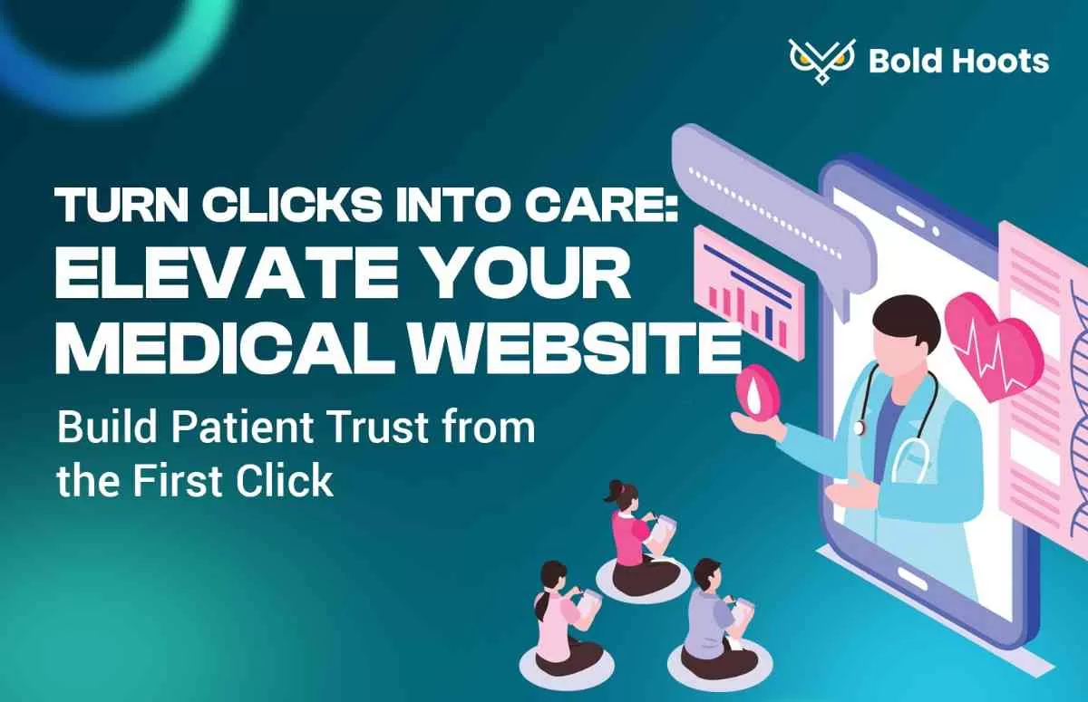
Medical Clinic Website Design: Engaging Patients and Building Trust Online
In the healthcare industry, a website isn’t just a marketing tool – it’s often a critical extension of patient care. People turn to medical clinic websites to find doctors, learn about services, and even manage appointments or access health resources. A well-designed medical or healthcare website can make a strong first impression, reassure visitors, and facilitate their journey to becoming patients. In this guide, we’ll explore best practices for medical website design, focusing on how to create a site that is patient-friendly, informative, and conversion-oriented (with conversions being things like appointment requests or contact inquiries).
Understanding User Intent in Healthcare
When someone visits a medical practice’s website, they typically have specific questions or tasks in mind. It’s vital to design with these user intents front and center. For example, a new patient might wonder: “What services do you offer? Who are the doctors? How do I book an appointment? Where are you located?” Your website should quickly answer these. An existing patient might visit to find clinic hours, download a form, or pay a bill online. By mapping out these common needs, you can ensure the most sought-after information is easy to find.
Think like a patient: Often, people coming to a medical site are in a state of concern or urgency – they might not feel well or might be anxious about a condition. Thus, your website should be especially clear, calming, and easy to use. Empathy in design goes a long way here. Use language that is understandable (limit medical jargon for general pages), and organize content in a logical, intuitive way.
Core Design Principles for Medical Clinic Websites
A successful medical clinic website strikes a balance between professional and approachable. Here are some core principles and elements to focus on:
- Clean and Modern Aesthetics: First impressions form in milliseconds, and a modern-looking site immediately conveys professionalism and credibility. Avoid clutter. Use a calming color scheme (many healthcare sites use blues, greens, or whites which are associated with cleanliness and calmness). Ensure your logo and branding are prominent so visitors know they’re in the right place. High-quality imagery is important – consider photos of your actual office and staff if possible, because seeing genuine smiling faces of doctors/nurses can build trust more than generic stock photos. However, if using stock images, choose ones that feel authentic and caring (for example, images of patient and doctor interaction, or a friendly receptionist at a desk).
- Mobile-Friendly Design: A huge number of users will find you on mobile devices. It could be someone searching for urgent care on their phone. Make sure your site is responsive and that key info (like phone number, address, directions) is immediately accessible on mobile. Google’s data has shown a majority of healthcare-related searches happen on mobile. Also, keep in mind older patients might be visiting on mobile with less tech-savvy – so keep things simple and enlarge touch targets for ease of tapping.
- Fast Loading & Accessible: Patients won’t wait long for a site to load, especially if they need quick info. Optimize images and code for speed. Also, design with accessibility in mind: use sufficient contrast for text (many older users have visual impairments), ensure the text can be resized, and use alt text on images (important for screen readers). A patient with disabilities should be able to navigate the site comfortably (consider following WCAG guidelines for accessibility).
- Consistent Branding and Reassuring Elements: Use consistent fonts, colors, and style across the site to present a cohesive brand. Include branding elements that reassure visitors they’re making a good choice. This can be subtle design choices or explicit content like badges (for example, “Voted Best Clinic 2025” or logos of affiliations and certifications). Design-wise, ample white space and an uncluttered layout can subconsciously imply order and trustworthiness, which is what you want in a healthcare context.
Content is as much a part of design as visuals are, especially on a medical clinic or hospital site where trust and clarity are paramount.
Must-Have Content and Sections
Here are key sections/pages your medical clinic website should have and tips on designing them:
1. Homepage – The Patient Gateway
Your homepage often serves as the first point of entry. It should immediately communicate who you are and what you do. Key elements to include:
- Welcome Message or Tagline: A brief headline that summarizes your mission or specialty. For example, “Comprehensive Family Healthcare in [City]” or “Your Trusted Pediatric Clinic.” This sets the context for visitors right away.
- Primary Calls to Action (CTAs): Think about the top actions a visitor might take. Common ones are “Request an Appointment,” “Find a Doctor,” or “Our Services.” Make these CTAs prominent, usually as buttons. For instance, a bright “Book Appointment” button could feature in the header and again in the body.
- Overview of Services: Provide a snapshot of what you offer. This could be done with icons or images representing categories like Primary Care, Cardiology, Pediatrics, etc., each linking to more detail. Keep the descriptions very short here – the goal is to show breadth and let users click for more.
- Patient Testimonials or Reviews: Including a short testimonial from a patient (“Dr. Smith really listens to my concerns…”) can be powerful social proof. If you have good reviews on Google or health grades, showcasing a few can immediately build trust.
- Contact Info and Location: Many people come just to grab a phone number or address. Don’t hide it. Ideally, have your phone number at the top of the site (and make it tap-to-call on mobile). Also, in the footer or header, list your main location address (perhaps linking to a Contact or Locations page). Some sites even put a small map on the homepage footer. At minimum, “Contact Us” or “Locations” should be clearly accessible from the homepage.
Visually, the homepage might feature a rotating banner or hero image – for example, a slider with images of happy families or doctors at work, overlaid with key messages or announcements (like “Flu Shots Now Available – Schedule Today”). Just ensure any auto-rotating banner doesn’t distract or obscure important info; also give manual controls (some users may want to pause or skip slides).
2. About Us / Our Team
Patients want to know who will be caring for them. An “About Us” section often contains:
- Doctor and Staff Profiles: List your physicians with photos, names, titles, and a brief bio. For doctors, mention their qualifications, specialties, and maybe personal approach to care. A friendly photo and bio humanize your practice immensely. Consider organizing by department or alphabetically. Each profile could be its own page if detail is long (with education, board certifications, etc.), or a short blurb on one page if concise.
- Mission and Values: A paragraph or two about the clinic/hospital’s philosophy can resonate. E.g., “We believe in compassionate, patient-centered care and have been serving the [City] community for 20 years.”
- Facility Tour (if applicable): Some sites include a few photos of the facility or a virtual tour. This helps patients know what to expect when they visit (and can alleviate anxiety). Design-wise, maybe a gallery or embedded video.
- Awards/Accreditations: If your hospital or practice has any notable awards, certifications (like JCAHO accreditation, or “Magnet” status for a hospital, etc.), display those logos or mention them. That might fit in an “About” or even homepage.
3. Services (and Conditions Treated)
This section details what you offer. It’s wise to break this down into subpages if you have multiple services or specialties:
- Services Overview Page: A main page listing all major services or departments, each linking to a dedicated page. For example: Primary Care, Women’s Health, Cardiology, Physical Therapy, etc.
- Service Detail Pages: Each service page should describe what it entails. Include what treatments or approaches you offer, maybe which doctor(s) handle it, and any patient info needed (e.g., “please bring X documents for your first physical therapy visit”). These pages can also list related conditions you treat. For instance, a cardiology page might list conditions like hypertension, heart disease, arrhythmia, etc., to catch search terms and inform patients.
- Design tips: Use clear headings and possibly icons for each service to make scanning easy. Keep paragraphs short and use bullet points for lists of conditions or treatment options. Remember, readability is key – patients are not likely to read a wall of text. Consider a sidebar or callout box for quick info like “Need an appointment? Call 555-1234”.
4. Patient Resources
Having a dedicated section for patient info is extremely helpful. Things to include:
- Appointment Scheduling: If you offer online appointment requests or booking, highlight it. This might be an online form or a portal login (if using a system like MyChart or similar). If scheduling is by phone only, ensure the process is explained (“Call our office at 555-1234 between 8am-5pm to schedule.”).
- Patient Forms: Allow new patients to download or fill out registration forms in advance. PDF downloads are common. Make sure they are easily downloadable and ideally listed with a short description (e.g., “New Patient Intake Form (PDF) – please complete and bring to your first visit”).
- Insurance and Billing Info: Clearly list accepted insurance plans or payment options. Patients often look for this. A simple list of insurers or a note like “We accept most major insurance plans, including Aetna, Blue Cross Blue Shield, Medicare, etc.” is good. Also, give an overview of billing policies (e.g., co-pay expectations, or financing options if relevant).
- FAQs: Common questions like “What is your cancellation policy?” or “How do I request a prescription refill?” can be put in a FAQ section. This is often done in an accordion style for easy scanning.
- Patient Portal: If you have an online portal for patients to view results or send messages, provide a clear login button or link (likely in a top menu or a standout button). Label it clearly (“Patient Portal Login”). Many medical sites put this at the top for easy access.
Design-wise, the Patient Resources can be a hub page with icons or links to the various things above. Consider the user flow: a new patient vs a returning patient might need different info, so make both readily accessible.
5. Contact and Appointments
Make it extremely easy for patients to contact you or find you. The Contact Us page should include:
- Phone Numbers: Ideally separated by department if multiple (e.g., clinic vs. after-hours nurse line vs. hospital main line). Use large font, easy to click on mobile.
- Addresses: Full street addresses of your locations. If you have multiple offices or clinics, list each with an address, maybe the doctor(s) at each, and hours. Embed a Google Map for each location for interactivity (people can get driving directions right from there). Ensure the map is responsive on mobile.
- Hours of Operation: Clearly state hours for each location or the main office hours. Also note any urgent care or ER hours if applicable (like “Emergency Department: Open 24/7”).
- Email or Contact Form: Some practices offer a general inquiry form or an email for non-urgent questions. If you do, include that – but also caution not to submit emergency requests via form. Be mindful of HIPAA though; often, email isn’t fully HIPAA compliant unless you have a secure messaging solution, so many opt for just phone or portal messages for anything personal.
- Appointment Request Form: If you haven’t put appointment scheduling elsewhere, a form here can allow patients to request an appointment (usually they provide name, contact, preferred date/time, reason). Make sure to follow up quickly if you offer this.
- Emergency Info: For certain medical sites (like hospitals or urgent cares), you might clearly say: “If you have a medical emergency, call 911 immediately.” It’s a good idea to have that disclaimer if relevant, often in a footer or contact page.
6. Additional Considerations
Some other features/sections that could enhance a medical website:
- Blog/Health Library: Educational content like articles on health tips, news about the practice, or medical insights can position you as an authority and improve SEO. If you have capacity to maintain a blog, design it with categories (e.g., Wellness Tips, News, Events). Keep it secondary to the main purpose (patients finding care info), but it’s a nice value-add.
- Accessibility Tools: As mentioned, make sure font sizes are adequate. Some medical sites include a toggle for larger text or even an “accessibility menu” plugin that allows changing contrast or font size. It shows a commitment to serving all patients.
- Language Options: If you serve a multilingual community, consider offering content in another language (e.g., a Spanish version of key pages). Even a PDF of patient forms in that language helps. Make language switchers clearly visible (flags or language names on the top of the site).
- Privacy Policy & HIPAA Notice: Typically in the footer, link to your privacy practices or HIPAA compliance statements, since healthcare is bound by privacy regulations. These don’t affect design much but are needed for completeness.
- Site Search: Including a search bar (especially if your site has a lot of pages or a health library) can help users find what they need faster. Ensure it’s visible (often in the top navigation or header).
Engagement and Conversion Elements
Just like any business website, you want to encourage user engagement and conversions (in this context, likely scheduling a visit or contacting you). Some engagement strategies suited for medical sites:
- Online Chat (Carefully Implemented): Some practices use a live chat or chatbot for basic queries (e.g., “Hi, can I help you schedule an appointment or answer a question?”). If using this, ensure it’s HIPAA compliant for any health info. Often, it’s used for general questions or to capture contact info for a callback. A chatbot could also simply guide users: “What are you looking for? [ ] Find a Doctor [ ] Clinic Hours [ ] Services” etc., acting as an interactive menu.
- Calls to Action on Every Page: Don’t leave pages as dead ends. For example, at the end of a doctor’s bio, have a link or button: “Book an appointment with Dr. Koirala.” On a services page about physical therapy, include “Contact us to learn more about our Physical Therapy program” or “Schedule your first session”. These gentle prompts throughout the site keep the user moving toward converting.
- Internal Linking: Link relevant content together. On a service page about Pediatrics, link to the profile of your Pediatrician. On a blog post about “Tips for Flu Season,” link to your Immunization Clinic page or a call-to-action to schedule a flu shot. This interlinking improves user engagement (and SEO).
- Imagery and Video: People resonate with visuals. A short welcome video from the clinic director or a video tour can engage visitors more than text. Or patient testimonial videos (with permission) can be powerful. Ensure videos are set up in a way that doesn’t slow down the site (embedding from YouTube or similar is one approach). Place videos in a way that they complement rather than overwhelm (maybe as an option to play, not auto-playing with sound).
- Trust Badges and Certifications: We touched on this, but from a conversion standpoint, seeing things like “Board Certified”, “Member of American Academy of Dermatology” or logos of well-known institutions you’re affiliated with, can reassure patients that your practice meets high standards. Design these into your footer or sidebar perhaps, or an “Affiliations” section.
- Testimonials/Reviews Page: Beyond a snippet on the homepage, having a page of testimonials or patient stories (if you have them) can be convincing. Just ensure you have patient consent for any detailed stories, due to privacy. Some clinics include only first name and last initial or similar to maintain some anonymity.
Example Scenario: Putting it All Together
Let’s imagine a user flow: Sarah is searching for a new family doctor in her city. She googles and finds your clinic’s website.
On the homepage, she immediately sees a welcoming image of a doctor with a family, a tagline “Caring for Your Whole Family in One Clinic,” and a prominent button “Make an Appointment”. She also notices a quick blurb that you offer family medicine, pediatrics, and women’s health all in one place. This makes her feel like she might have found the right spot.
She clicks “Find a Doctor” in the menu and goes to the Our Team page. She sees profiles of the doctors. Dr. Jane Doe, MD – Family Medicine, has a kind-looking photo and a bio that mentions 10 years of experience and a philosophy of listening to patient needs. Great, Sarah likes this.
Now she wants to know if you accept her insurance. She goes to Patient Resources and finds “Insurance & Billing.” There, she sees her insurance listed as accepted – relief!
She decides to book an appointment. She clicks the “Request Appointment” button which is in the header. It takes her to a simple appointment request form. She fills it out with her contact info and preferred date. Shortly after, she receives a confirmation email saying the clinic will call her to finalize the appointment. Smooth experience.
During this process, she also noticed the site had a sticky header with the phone number, so if at any point she was confused she could have just called. And the design on her phone (she did part of this on mobile) was easy – big text, easy taps, etc.
This is the kind of user journey we aim for: the site anticipated her questions (services offered, doctors, insurance, how to contact) and answered them clearly, while conveying trust (through bios, imagery, and a professional look). That’s effective medical website design in action.
Final Thoughts
Designing a medical website requires special attention to empathy, clarity, and trust. Always keep the patient’s perspective in mind: often they are anxious or in need of quick info. By making your site welcoming, informative, and easy to navigate, you serve your community better and likely attract and retain more patients.
Remember to keep content up-to-date (outdated info on doctors or hours can frustrate users). Compliance (like ADA, HIPAA) is important – consult those requirements as needed when adding certain features like forms or chat.
In the end, your website should reflect the quality of care you provide in person. It’s often the first “interaction” a patient has with your practice. With the tips outlined above – from modern design and mobile optimization to surfacing key info and strong calls-to-action – you can create a medical clinic website that truly supports and grows your practice, while helping patients feel comfortable and cared for from the moment they click onto your page.